Honestly, I think most photographers don’t give color theory the attention it deserves. They’re too busy worrying about gear and technical settings to consider the emotional impact of color on their images. But look, color is what sets the tone for your entire photograph – it’s what draws the viewer in and keeps them engaged. I’ve seen photographers like Annie Leibovitz use color to create bold, eye-catching portraits that are instantly recognizable¹.
You can’t just point your camera at something and expect the colors to magically work together. It doesn’t work that way. You need to understand the basics of color theory, like the color wheel and how different hues interact with each other. I remember reading about the color wheel in “The Art of Photography” by Bruce Barnbaum², and it completely changed the way I approach color in my own work.
The color wheel is like a map, showing you how different colors are related to each other. It’s divided into primary colors (red, yellow, and blue), secondary colors (orange, green, and purple), and tertiary colors (yellow-green, blue-green, etc.). Understanding how these colors work together is crucial for creating cohesive, visually appealing images. For example, if you’re shooting a landscape with a lot of greenery, you might want to use a complementary color like red to create contrast and draw the viewer’s eye to a particular part of the image.
I believe that one of the most important principles of color theory is color harmony. This refers to the way different colors work together to create a visually appealing effect. There are several different types of color harmony, including monochromatic, complementary, and analogous³. Monochromatic color harmony involves using different shades of the same color to create a cohesive, soothing effect. Complementary color harmony, on the other hand, involves pairing colors that are opposite each other on the color wheel to create a bold, contrasting effect.
Why Most Beginners Get Lighting Wrong
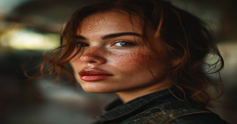
Lighting is another crucial aspect of color theory that many photographers struggle with. I’ve seen beginners try to use flash or artificial light to create a specific mood or atmosphere, but it often ends up looking forced or unnatural. Natural light, on the other hand, is always the most flattering – it’s what creates those beautiful, warm tones that make your images look alive. Take a look at the work of photographer Peter Lindbergh, who’s known for his stunning use of natural light⁴.
When it comes to lighting, I think the key is to keep it simple. Don’t overcomplicate things with too many lights or reflectors – sometimes, the most beautiful light is the light that’s available to you. I’ve shot some of my best images using nothing but the available light, and it’s amazing how much depth and texture it can add to your images. Of course, there are times when you need to use artificial light, but it’s all about using it in a way that looks natural and authentic.
It’s not just about the type of light, either – it’s about the time of day, the direction of the light, and the way it interacts with your subject. I love shooting during the golden hour, when the light is soft and warm and creates a beautiful glow. It’s the perfect time to capture portraits or landscapes, and it adds a level of depth and emotion to your images that’s hard to achieve at other times of day.
The Power of Color Grading
Color grading is another aspect of color theory that’s often overlooked, but it’s incredibly powerful. By adjusting the color tone and saturation of your images, you can create a specific mood or atmosphere that draws the viewer in. I’ve seen photographers like Martin Parr use color grading to create bold, vibrant images that are instantly recognizable⁵.
You can use color grading to create a cohesive look across your entire portfolio, or to add a specific tone to a particular image. It’s all about experimenting and finding what works best for your style and vision. I’ve spent hours playing around with different color grading techniques, and it’s amazing how much of a difference it can make to your images.
For example, if you’re shooting a portrait, you might want to use a warm color grade to create a cozy, intimate atmosphere. On the other hand, if you’re shooting a landscape, you might want to use a cool color grade to create a sense of distance and grandeur. It’s all about using color to tell a story and evoke a particular emotion in the viewer.
That’s what color theory is all about – using color to create a specific mood or atmosphere that draws the viewer in. It’s not just about technical settings or gear – it’s about understanding the emotional impact of color and using it to create images that are visually appealing and cohesive.
Check out the work of photographer Steve McCurry, who’s known for his stunning use of color and composition⁶. He’s a master of using color to create a sense of place and culture, and his images are always visually stunning.
Look, mastering color theory takes time and practice, but it’s worth it. By understanding the basics of color theory and how to apply them to your photography, you can create images that are truly stunning and cohesive. So don’t be afraid to experiment and try new things – it’s the best way to learn and grow as a photographer.
It’s all about using color to tell a story and evoke a particular emotion in the viewer. And honestly, that’s what photography is all about – creating images that are visually appealing, emotionally resonant, and memorable.
References:
¹ See Annie Leibovitz’s portfolio at https://www.annieleibovitz.com/
² Barnbaum, Bruce. The Art of Photography. Rocky Nook, 2010.
³ For more information on color harmony, see the article “Color Harmony: A Guide for Photographers” at https://www.digitalphotography-school.com/color-harmony/
⁴ Check out Peter Lindbergh’s work at https://www.peterlindbergh.com/
⁵ See Martin Parr’s portfolio at https://www.martinparr.com/
⁶ Check out Steve McCurry’s work at https://www.stevemccurry.com/